This is something that I have to constantly do on our HubSpot COS websites. I have included the instruction here for people looking for this HubSpot snipet offten.
The first step in creating full width sections of your website is to confirm that the body of your site is full width. If the body or any of the section containers are constrained to a fixed or maximum width you will not be able to achieve this look.
Step 1:
Group the modules you wish to add the background to. It is helpful to give groups a name the correlates to the content or style associated with it.
Step 2:
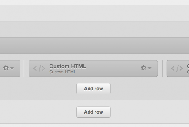
Group them again.
Your groups should look something like this.
Step 3:
Assign the class page-center to the inner group, in this case the "call-us" group.
Step 4:
Assign the class full-width-bg to the outter group, in this case the "call-us-wrapper" group.
Step 5:
Add the following code to your CSS file in the code editor section of the Template Builder.
 .page-center{

              max-width: 980px;

              margin: 0 auto!important;

              float: none!important;

          }
This code will force the inner group to be centered within a maximum width. You can change the max-width to what ever width works for your site design.
Step 6:
It is time to add the background to the group. You can make it a color, or use a background image. If using an image, make sure that the file size is small so that it does not slow down the load time of the page.
If using a color, add the following code to your CSS file, substituting "#ddd" with the hex color you wish to set the background:
.full-width-bg{

          background:#ddd;

     }
If using a small repeatable file, add the following code to your CSS file:
.full-width-bg{
background-image: url ('your image url here') repeat;
}
Read the original article here.


Comments