What are the new web design standards and what do great websites look like in 2017? Great web design is constantly evolving. Things that were modern yesterday can become outdated overnight. Here's what you REALLY need to know.
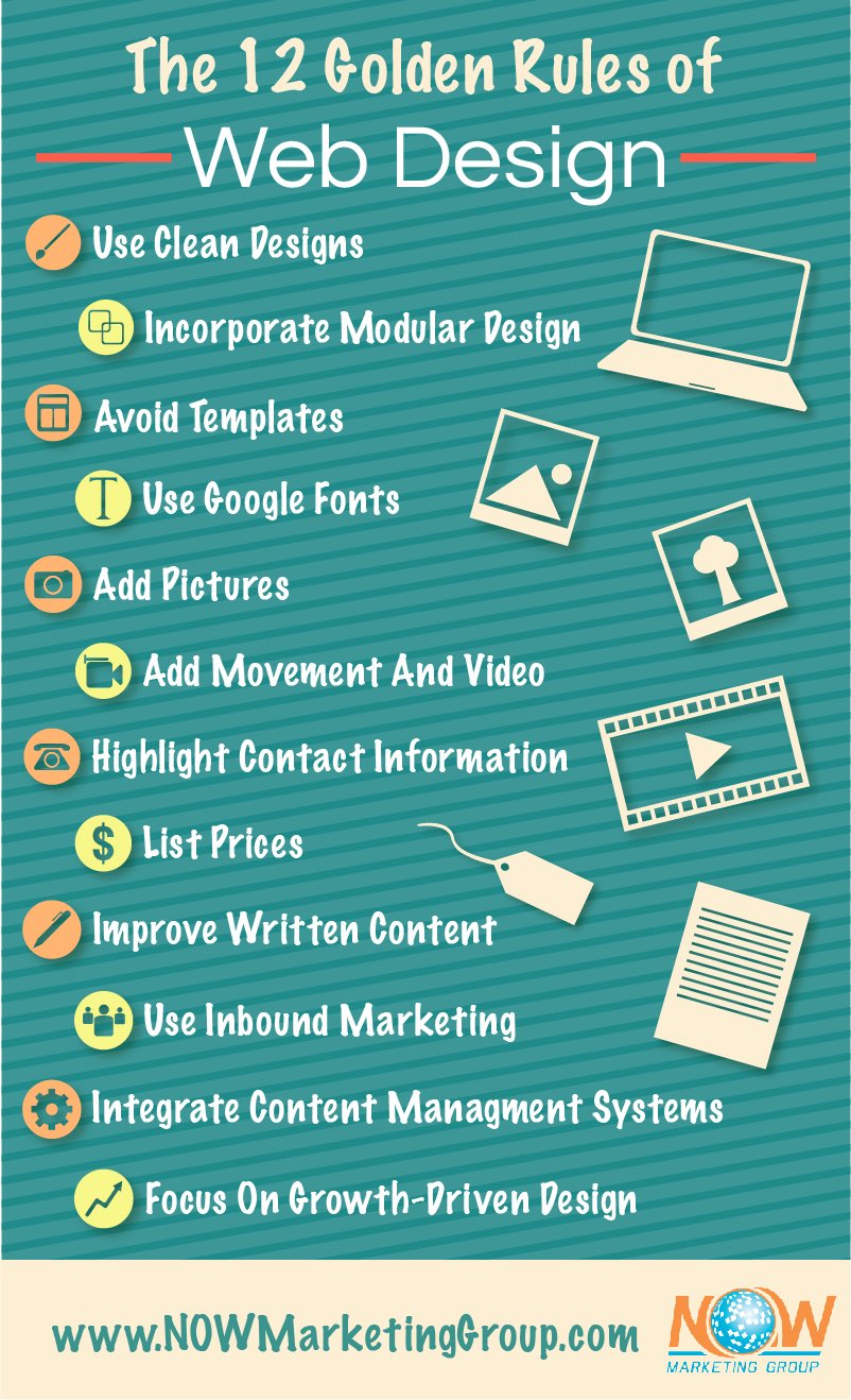
Use clean designs
You want a clean user interface and design. This means the right colors, fonts, images, and navigation. Your users should not have any issues with navigating your site. In fact, try having fewer menus but a website that still leads viewers to what it is they most want.
Incorporate modular design
Including modular design is a foolproof way to have an accessible website in which visitors remain interested. In websites, modular design incorporates grid-based, flexible patterns. Grid-style formats work well for conveying a minimalist feel to your website, one that helps add cohesion in cases where there is a lot of information in one place.
Avoid templates
Try to avoid templates when constructing (or improving) your website. Google will penalize your site for this; frameworks and pre-made themes might seem helpful to a beginner, but they can contribute to bloated code.
Use Google fonts
Make sure you are using Google fonts across your site. Google revamped its font service last year, and now previewing and configuring fonts is faster and easier than before. A few lines of straightforward text in a font that suits your site's personality can work wonders, giving your website a modern, uncluttered look.
Add pictures
You need pictures on your site, but you need authentic ones. Avoid stock photos; you don't want images that are copied from elsewhere-it will hurt you in the end. Images, videos, anything on your site needs to be uniquely yours, content you own.
Add movement and video
When designing the site or adding to it, make sure you have videos. Your site needs movement, such as a central banner with three rotating images or an interesting video. Lots of gadgets let you finally mix web design and 360º video. Incorporate video into your site so that it becomes an interactive experience, one that showcases your products or services.
Highlight contact information
Make usability and utility your main focus. Do your visitors a favor by adding your phone number and other contact information directly into the header and the footer.
List prices
If you are selling anything, make sure the prices for your goods or services are easily accessible on the website. People do not want to search to find a price.
Improve written content
You need great written content, especially for blogs. Add a blog to your website and publish at least once per week. Beyond blogs, you need conversational content for your website visitors. This content should attempt to answer all of their questions before they even ask them.
With the evolution of voice searching, people are expecting more complex answers than ever before. Google Hummingbird is a new algorithm that approaches search engine questions in a more intelligent way, one that uses new technology. It is named after the hummingbird because of how accurate and fast it is. The goal is to give users actual answers to their questions, just like your website content should do.
Use inbound marketing
This goes hand in hand with having a blog. Adding a quick contact form is another way to use inbound marketing. When you naturally attract customers and prospects by giving them quality content on your website, you can convert them into repeat buyers. You want to increase leads and build awareness by providing content that educates, informs, and engages with your target audience. Inbound marketing includes tactical content such as white papers, blogs, eBooks, video tutorials and more.
Focus on growth-driven design
Whether you're designing a new site or revamping an old one, use a growth-driven design. This term refers to developing or redesigning your site in intentional increments. By making continuous adaptations based on the latest data, you avoid laboring to try to make every page of your site perfect before you launch. Instead, minimize risk by continually making small changes as necessary to generate the leads you need. This method is meant to preserve your resources and your time, by way of eliminating wasteful changes and adding user-driven website improvements all the time in small increments. Using a growth-driven design makes your website more agile and keeps your costs lower.
Integrate content management systems
In addition to all of the above, you'll want to use a content management system like Wordpress. This will make SEO a lot easier. Managing the things you publish, like your blogs and other inbound marketing content, is more easily and effectively done with such a system.
Overall, modern websites should use authentic images, minimum navigation, movement, clean designs and, most important, well-written content.

Sources:
NOW Marketing Group- What content works on websites
NOW Marketing Group- why inbound marketing for SEO
NOW Marketing Group- Responsive Design
https://econsultancy.com/blog/68600-10-sensible-web-design-trends-for-2017/
https://blog.hubspot.com/marketing/web-design-trends-2017#sm.000011vr6ouaz4etoy7gccyakhstg
https://www.smartinsights.com/user-experience/essential-2017-web-design-trends/
https://www.forbes.com/sites/tomaslaurinavicius/2017/01/25/web-design-trends-2017/#6edfbe49402d
https://searchengineland.com/10-wordpress-seo-questions-took-10-years-answer-214050


Comments