-4.png)
Have you heard of Ad World? It’s legit the MECCA of ADS… the world's largest advertising conference… and we had our “seats” front and center. Let's just say: our minds are blown. We’ve narrowed our takeaways to give you our Top 10 that you can use to help your business today.
Let’s dive in!
1) Generate Word Clouds Of Our Reviews
In order to have great ad performance, it's super important to spend time doing the research. Generating word clouds is a quick and easy way to find common words people say when reviewing a brand. Nick Shackelford mentioned using a word cloud generator to create word clouds for both positive and negative reviews.
Using a word cloud generator will show us which words we should start using more in our product messaging and positioning. These are also great in showing what we should say in our advertising copy as well as in our creative.
Nick recommended using this Word Cloud Generator from MonkeyLearn. Here’s an example we did with one of our client accounts for positive reviews:
We can see some of the less obvious words that stick out are “water intake”, “cup holder” and “leak proof”. Now that we know how our personas/audience members are using these words, we can leverage them in our ad copy, website copy and new creative. This is the beauty of using word clouds.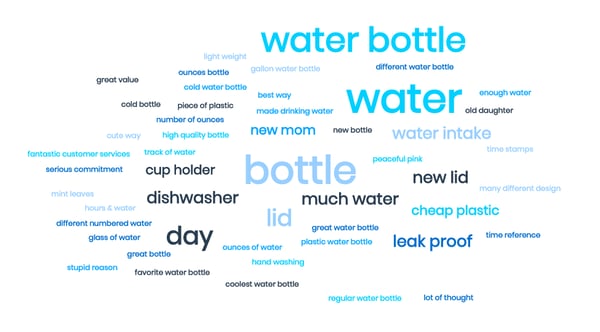
What comes after research? Action! Let’s jump into how we can optimize our landing page even more with this next tip.
2) Reduce The Number Of Options Visitors Have

Have you ever looked at a new restaurant menu and got lost in the options you had? Too many options can make it tough to decide? Likewise, giving website visitors too many options can make them indecisive. Worse, they’ll leave your website entirely because it’s not an easy decision for them.
Hick’s Law states...
“the more choices someone has to make a decision, the longer it takes for them to decide.”
Alex Brown shared this in his talk on conversion rate optimization. When it comes to our website, we should only show people relevant options and simplify it as much as we can so making a buying decision is easy.
In 2020, more and more websites are offering personalized product recommendations and these work because they are simplifying the options they give site visitors. We may land on a website and instantly be asked to take a quiz to find the right product. This works more efficiently because it personalizes the experience and only shows products relevant to our consumers.
The main point? Think about how we can simplify the amount of choices you give to your website visitors.
Pro Tip >> show “recommended” or “best sellers”
We often see this when companies have various pricing tiers. They may show options with the middle tier highlighted. Even stores with the world’s products at their fingertips, like Amazon, still show best sellers and recommended items, instead of overwhelming shoppers with the enormity of their product list.
Alright, so now our choices are easier to decipher, how can we get people to buy from us?
3) Add Scarcity In Your Landing Page Copy

Alex Cattoni spoke at Ad World about optimizing copy for landing pages. One her key points was to add scarcity in our website copy. Without having scarcity in our copy, people will often wait to buy or not buy at all. Not good!
4 Ways To Add Scarcity To Your Website Copy
- Price - Tell people when the price will go up. This adds scarcity and emphasizes that our product is at its cheapest price now. For example, on our product page it might say the price “goes up to $199 on December 1st.”
- Quantity - If we have limited quantities, tell people we only have a curtain amount of products left. For example, you may have seen sites like Expedia do this a lot by saying “Only 3 rooms left.” This adds urgency to the buyer and makes them aware that the products are in limited quantity.
- Premium - Offer people bonuses that will go away after a specific time period. You’ve probably seen this before, especially around Christmas time when companies may add in bonus items. For example, “Spend over $50 and receive a free limited-edition hat.” Or in the grocery store you may see alcohol bottles for sale with collector’s edition glasses for the holidays. These are all premiums added to products to get people excited to purchase.
- Offer - Add scarcity by letting people know when the deal ends. For example, “Offer ends December 20th.” Sometimes you may even see countdown timers on websites to emphasize offers ending.
We’ll want to make sure we add some sort of scarcity trigger to our landing pages, so people are more incentivized to purchase from us today.
What’s another way we can lead people towards the buy button?
4) Our Products Should Face The Right Way

One of the classic web design tips you may have heard of before is to have images of people’s eyes on our website looking toward a call-to-action (CTA) button such as “sign up” or “shop now”. Website visitors naturally will look at where a person on our website is facing. Joe Doveton mentioned another angle on this same idea, just using our products instead.
Have products actually face call-to-action buttons. Joe said his team did a heat map study and noticed that when products faced away from important CTAs on a website, people did not click on them as much as when the product faced the button. It’s important to know how people view websites, so we can leverage the data to make our website experience better.
Another major aspect of making our website have credibility and trust is to add testimonials.
5) Use Testimonials To Combat Objections

When it comes to selling anything, we always want to think about what objections the customer might have. From there we can write down how we’ll handle those objections and then we can test it out in our next sales pitch. This tip is essentially doing that same process, but on our website with copy.
For example, if people often say our product is too expensive, we should look to see if we have a testimonial talking about how our product is worth every penny. Or maybe we have a customer who said they would have paid double what the product cost. These are perfect testimonials to use to combat objections of new visitors.
Now when customers are looking at our product pages online, they can see how other customers felt the same and how their worries went away since they purchased the product. This adds trust and helps to handle potential customer objections.
Another way to handle product objections is to make a promise.
6) Make A Promise With Our Product
People buy products with better promises. We need to find out what makes our products/services stand out from our competition and leverage that in our product description and advertising copy. Keep in mind that people often see ads that have similar products and messaging. This dilutes the copy and makes brands all look the same. The brands that win are the ones that stand out and don’t blend in.
It’s important to ask ourselves: how does our product actually differ from competitors? Emphasize that difference and make a better promise than everyone else.
Another place to grab people’s attention is in our website’s header.
7) Have A CTA In the Site Header

People often use their websites to grow an email list and to sell products. In order to do that, adding a CTA button on our website and throughout various pages will be helpful. Ezra Firestone suggested adding another CTA in our website’s header to help increase our conversion rates even more.
Having people join our email list is a softer call to action than asking someone to buy. You can see Ezra added the CTA in this site header here that says “Join the Boom Club”:
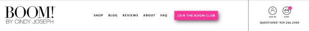
Notice how much the button stands out in the header compared to everything else. This can help to reduce website bounce rates and get more people added to our email list. We should grow our email list more, so we can utilize the list to sell our products.
We can sell our products with...
8) The 4 Types of User-Generated Content We Need To Be Using

User-generated content (UGC) is always some of the best performing content we can have for our ads. It’s added social proof that performs much better than standard brand posts.
Mirella Crespi broke down the four types of UGC we should use in our ads:
- Unboxing - Have our customers show people what the unboxing experience is like. We’ve seen this work really well for products that people often gift, such as personalized and custom products like engraving or art. If we have an exceptional unboxing experience, we definitely want to show this to potential customers.
- Product demos - Have customers show how our product works and what the process looks like. This takes the guesswork out of people’s minds and can answer a lot of questions that people may have on the use of the product.
- Product reviews - Testimonials are powerful. Have our customers talk about why they love your products.
- Lifestyle shots - Lifestyle shots are where we show how the product is used in everyday life. Try to show the product in the various environments it may be used in such as at the park, the beach, family gatherings, etc. This helps potential customers see how our product could work in their life.
Aim to get various kinds of UGC created from our customers. We can leverage this social proof throughout our website, in email copy, in ads and more. When we gather enough UGC, we can compile some together and...
9) Make Better Video Ads Using The Heartbeat Method

Chris Erthel spoke about how he’s sold millions of dollars of products by leveraging videos in his Facebook ads. One of his main tips for video is to use The Heartbeat Method.
The Heartbeat Method means to have a video change or transition every 1.5 seconds (about the speed of a heartbeat). Keep viewers engaged with our videos and watching them longer by changing angles, adding an overlay, or jump-cutting every 1.5 seconds.
We can do this if we have a variety of UGC videos and product shots. The idea? Create a compilation of them and show the highlights of each one to make a video ad that works. We can't forget to “hook” people’s attention within the first three seconds. We’ll keep them watching all the way until the end with the Heartbeat Method.
Test various combinations of videos in our creative, but also remember...
10) Our Ads Don’t Have To Be Complicated

Lauren Schwartz shared one of her favorite ads that she likes to create for her clients. She said put a product image on a white background, then have text at the top that has “a strong captivating headline.” (Reference tip #6 for ideas on headlines.)
What is nice about this method is we can test various callouts with the text. We can also test out various brand colors and fonts to see what messaging and branding grabs people’s attention the most. We can create these images easily using a free image editing tool such as Canva. (We freakin’ love Canva.)
Remember, ads don’t have to be complicated.
Summary
Ad World 2020 was packed with valuable insights, tips and strategies. As you can see from the takeaways above, we got a ton of value from the conference! So now, we want to hear from you!
What was your biggest takeaway from the recap? What are you going to implement next?
Let us know in the comments below.
Comments