
1. The viewport fix
All modern web browsers support the meta tag "viewport." The "viewport method" allows a website developer to put a special meta tag in the head of the website code that can specify how the website should act on different devices. The viewport is the window size of the user’s device. We can set options that allow the website to appear to fit in the device’s viewing port.
Another great option allows the user to pi tech to zoom. Using these simple options, you can make a website easier to navigate for someone using a tablet or smartphone.

The problem: This method makes the user zoom in and out constantly. It makes for an uncomfortable user experience. Secondly, the zooming functions are different on various devices. On IOS devices, there are little issues with this, however, on different devices the zooming can be very difficult.
2. The mobile site
A few years ago the best solution for making a mobile website was to make a completely mobile website separate from your website. You would have your main domain like this: www.yourdomain.com. Then you would have another site with a subdomain like this: www.mobile.yourdomian.com. A website developer would create a script that would check the viewport size on the browser being used, and if it was a mobile device the user would be redirected to the mobile version of the website.

The problem: Having a completely separate site means you will have to be paying twice as much to have someone update and manage your website. Most of the time there is not a system in place that changes your mobile site when your desktop site is updated. Keep in mind that all aspects of the website will need to be completed such as SEO, analytics and content optimization.
3. Responsive website
Finally for the good news! Responsive website design is by far the most effective method to use on any website. A responsive website will be optimized for most all modern browsers. When our rockstar design team starts designing a website they should be thinking mobile first. Why? As of 2013, 28 percent of website traffic is being done from mobile devices, that’s up 67 percent from 2012!
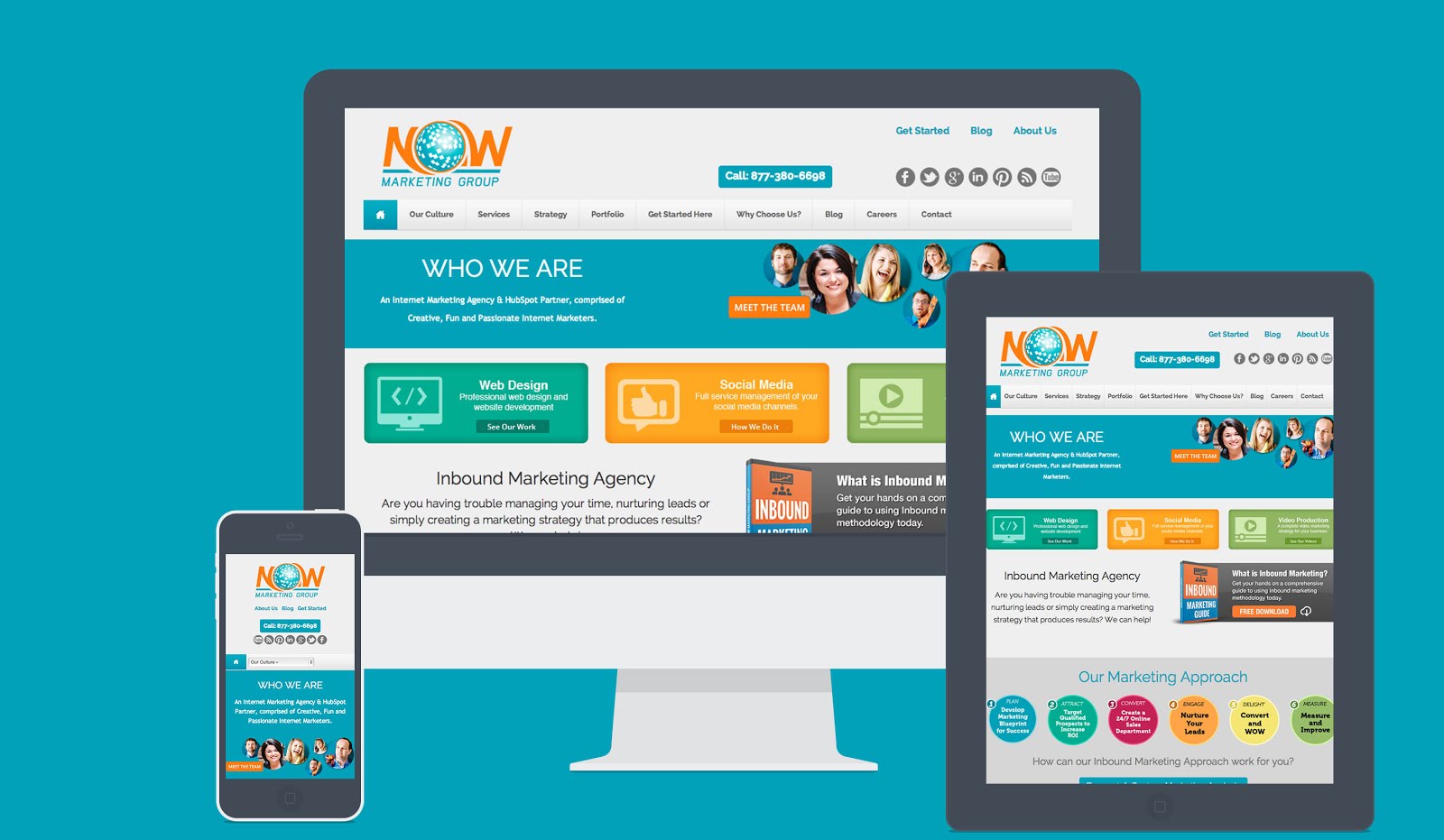
We want your content to look great on even the thinnest screen. To accomplish this we start with the iPhone in portrait mode first. With each increase in screen size, we are able to rearrange the layout of the website to be optimized for additional screen real estate. Using this method of website design will ensure your website is friendly with the majority of all web enabled browsers.
The problem: The biggest issue I have come across when developing for responsive design is the number of views we have to test. Instead of testing for one static screen size we have to make sure our design flows nicely on extra large, large, medium, small and extra small screens. This requires a little more time for coding but gives the best result!
Keep in mind that having a great looking website is the first step to getting noticed online. Have a look at this great blog all about Google's latest SEO updates called Hummingbird.


Comments