Any marketing agency will tell you that building a new website is no small undertaking. It requires a lot of planning, mapping and editing to get it right. Not to mention, best practices for building websites change constantly, making it a challenge to keep up with the latest trends.
That’s why we sat down with two of our team favorites: Tony Christensen and Brice Woodward. Tony and Brice are the guys we always go to when we want to get geeky and talk about what it takes to create a seamless, frictionless user experience online.
What People Want:
When it comes to web design in 2020 and 2021, one of the critical elements is that the site is responsive.
That means responsive design AND responsive communication.
“This year alone, people really want responsive communication.” - @tonydoesads (click to tweet)
Consumers are looking for websites that are mobile-friendly in all aspects… responsive in nature, but also in easy to use. Forms shouldn’t be a headache to use on a mobile device and if possible, make them intuitive and prompt with auto-fills for returning users. Not to mention, websites should be informative. It should be able to answer people’s questions. That’s the reason they’re there, right? To find a solution to their “need.”
People want to be able to know exactly how to do business with you and your website needs to be able to answer that in a clear and simple way.
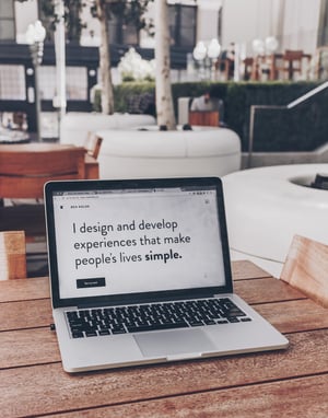 It’s all about meeting people where they’re at and today, we all want to be involved in the process.
Many businesses are adding elements to their websites that keep customers in-the-know, from ordering to delivery. If you can bring your customer with you and keep them involved in the entire process of doing business with you, they’re going to be more engaged.
Adopting A New Mindset:
When it comes to website building in 2021, it’s all about adopting a new mindset.
Moving from a transactional mindset to more of a journey. As a business, it’s time to think about how you can create multiple touch points along the way. For instance, we all know how nice it is to know that our DoorDasher is heading our way with our food. If you can turn something from a single, simple transaction into a multi-touch experience, you’re going to keep people with you.
When it comes to website evolution, it’s the shift away from asking customers to go where WE want them to go. Today, we are showing up and staying in touch with our ideal audience where THEY want to spend time.
Whether it’s through a freebie, messenger or email, setting up some type of “stay-in-touch” message system that keeps the conversation going is hugely important.
“Email is still a viable channel and it’s becoming increasingly popular. But, you don’t NEED to have a freebie or download. You just need some type of incentive like private access to content or discounts.” - Brice Woodard
Think about how you can provide value to your audience. It’s more about the value provided and less about the exact way (email, discount, free guide) that you provide that valuable information. The more personalized you can make the experience, the better.
For instance, noom does an excellent job at taking users through a customized process of selecting what’s best for their personal weight-loss/fitness journey. Right upon visiting the website, you answer questions and the results/next questions on the screen are based on what you previously selected. It’s all about asking specific questions in a screen-by-screen process that is customized to the specific individual.
And given that desktop converts at about 4.1% and mobile at 1.3%, any way that we can improve the user experience of our website will help increase those conversion rates.
Performing an Audit:
When getting ready to make improvements on your website, it can be super helpful to conduct a site audit. (We’ve even got a checklist for you on what to look for.)
Taking stock of where your website is now, and what you can improve on, will help clarify the priority action items to take. It will also help you understand who is using the site, where they’re going and where they’re getting stuck.
 Our biggest tip? Show someone (a friend or family member) your website for the first time and just WATCH how they navigate it.
Our favorite tool? Hotjar is a tool that both Brice and Tony love because it uses a heatmap to see customer behavior on your website. It’s a good way to find out what frustrates your customers AND what content they’re enjoying. You can see if someone is “rage clicking,” and run usability tests. Tony loves the tool because it lets you see if someone is clicking buttons at the bottom of the page which could signal the need to move something above the fold on your website.
Whether you use Hotjar or one of the other tools out there (there are SO MANY options, like SE Ranking) it’s worth taking the time to learn more about how you can improve your site’s technical components.
One final bonus tip when doing a site audit is to check your calls to action.
The trend is going towards cutting the copy which means that your message really needs to pack a punch. Your call to action is where you need to DELIVER, so use copy that is clear and concise. Clever doesn’t cut it when it comes to CTAs. Instead, be direct.
Quick Wins To Enhance Your Website:
So, can you do TODAY in order to improve the user experience of your website? What are some small action items that you can take right now to enhance your website with your audience in mind?
Tony and Brice chimed in with a number of tips:
- Get clear on the process: Take time to write out the entire sales process FIRST. This way, we can design the site and the flow based on the steps that users would take. This helps us find ways to eliminate friction and improve the user experience. It also helps ensure that you’re designing with mobile in mind. The more that we can put ourselves in the shoes of a first-time user, the better we’ll position the forms, buttons and valuable information on our site.
- Improve site speed: This is one of the easiest and fastest things we can do for a quick win. Google offers a free speed test (you’ll get a grade of what your score is) which gives us useful information about our speed site. Speed needs to be a priority.
- Reduce the number of form fields: Dropping the number of form fields down to the single digits can translate into an increase of our conversion rate, sometimes by over 100%! We need to ensure that our forms are easy to fill out and don’t have unnecessary fields. For example, a quick win can be to create ONE form field for “Name” vs. having two fields such as “First” and “Last”.
- Responsive form fills: It’s all about thinking how we can make it easier for both new and returning customers to fill out forms. For instance, responsive form fills (that recognize when a user is returning and pre-fill information that’s already been provided) are HUGE! They save the user time AND increase conversion rates. A good example of this is InstaCart. Think about how they automatically add our staple items to our grocery list. This is a huge time-saver for busy parents!
- Use chat: Implementing a chat function on our website, even if it’s just Facebook messenger, is a good way to get people the answers they are looking for, quickly. The faster we can get the desired information to our audience, the better.
- Make your buttons stand out: Since this is the main action we want people to take on our site, it’s worth testing. Try different colors AND copy for the call to action button. There’s a fine line between having too strong a call to action and one that doesn’t get the job done, so the language on these buttons is important. For instance, if our button says “Submit” vs “Click here”, conversion rates can be lower by 3%! We don’t want to be too aggressive with our button language.
A great website in 2021 goes beyond just speed, accessibility and responsiveness. It’s also about the content. The copy needs to be super clear and straightforward.
Brevity with content works. People don’t have time to browse through your entire site, so be sure to use language that resonates with your ideal audience.
Meeting Users Where They’re At:
At the end of the day, the best websites show that they care to meet customers where they’re at. It’s all about being a magnet and attracting the right people in vs. being a bullhorn and trying to shout at people.
 We don’t expect people to come to us; we aim to meet them where they’re already spending time.
Think: how can we make this the most engaging, relationship-building process possible?
When we have that in mind, we’ll never go wrong.
For instance, restaurants might not be able to invest in building a customized app. We totally get that! However, it’s possible to take advantage of the tech that already exists in the industry and get placed on DoorDash and Uber Eats. It’s about finding where our businesses can tap into what’s already working and benefit by having a presence in these places.
Let’s not reinvent the wheel but rather, tap into technology that already exists so that we add more access points for our business.
At the end of the day, we want to make our website accessible and easy to use. It’s about just being real; showing up as we are, with the right information, so we can let the right people build a relationship with us.
That’s what it’s all about.
What do you think? What tips do you have for performing a site audit? Do you have any tips to create small wins for those getting started improving user experience?
Let us know in the comments below!


Comments